
About
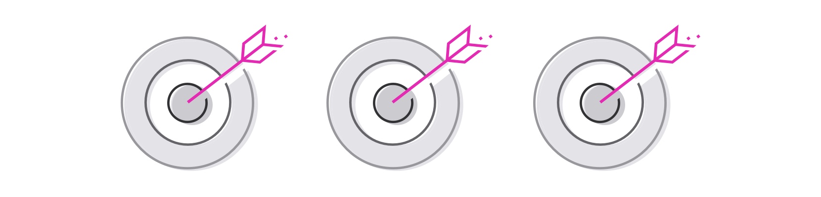
The 3M Design Compass is the culmination of our aim to produce better designs faster. It is designed to be an easily accessible hub for designers seeking 3M digital design process, styles, components, patterns and downloads.
Consistency
Our design compass will help us maintain 3M’s brand standards by ensuring repeatable design outcomes that are agnostic of individual preferences. We can build consistent and recognizable products across 3M with this system, which, in turn, can establish a trust and confidence in our brand to deliver intuitive and desirable user experiences. Maintaining this standard of quality and doing it consistently, communicates a unified, global brand message across our digital products and to our varied customers.
Efficiency
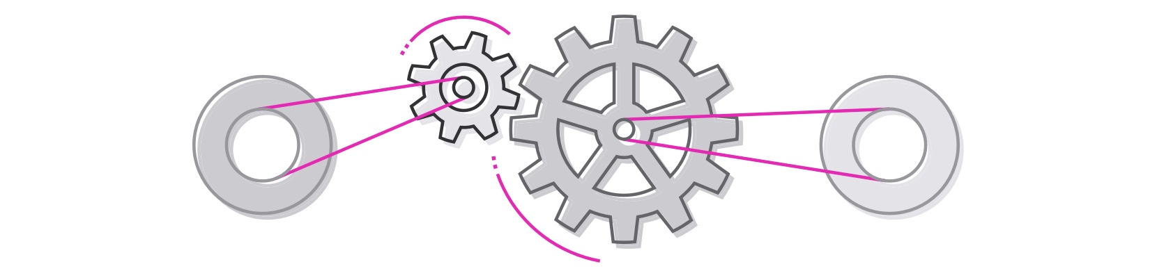
Reusable components and predefined patterns will help increase our production time and minimize wasteful effort. Established, vetted patterns will make cross-platform, performance, and accessibility compliance easier. Teams will have more time to focus on high-level strategic goals and creating experiences that are delightful for users.
Overtime, our design system will serve as an efficient foundation for communicating improvements and changes. As a result, we’ll be able to quickly and easily adapt to evolving technology and our brand standards.
Cohesion
A centralized design system facilitates collaboration and clear communication between team members, designers and developers. It unites us with a common language and helps align business groups and creatives across 3M on our principles, process, and beliefs. As our design system grows and evolves, visibility and access to changes will be essential in maintaining cohesion across 3M’s 5 divisions.

Design for Accessibility
“At 3M Design, we are applying creativity and our passion to translate 3M technologies and sciences into the creation of meaningful and relevant solutions. We are highly motivated to deliver design solutions that are inclusive to all. Our design mindset, related to Design for Accessibility, is based on the fact that everybody deserves experiences that are accessible no matter who you are. We know that accessible experiences translate into better experiences for all. That’s why we make it a priority to design digital experiences that meet the Web Content Accessibility Guidelines (WCAG) 2.1 level AA success criterion.”
– Eric Quint, 3M Vice President and Chief Design Officer
What is the WCAG and why does it exist?
The WCAG contain a spectrum of testable recommendations for making digital technologies more accessible. It’s guidelines consider a wide range of people with disabilities including blindness, low vision, deafness, hearing loss, learning disabilities, cognitive limitations, limited movement, speech disabilities, photosensitivity, and combinations of these. The WCAG addresses mechanisms like desktops, laptops, tablets, and mobile devices in an aim to help more people utilize the benefits of digital technology.
What are the WCAG AA success criterion?
The WCAG has 12 guidelines that are organized into 4 principles: perceivable, operable, understandable, and robust. For each guideline there are many testable success criteria. You can access all of the criteria at the W3C’s WCAG reference guide. Otherwise, we’ve summarized some of the most common things to consider:
Perceivable
Alternative Text
Alt text is read by assistive tech, giving those with visual or cognitive disabilities understanding to the content of images. It is also read by search engines which allow others to find your content.
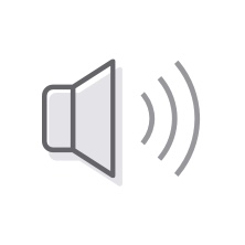
Captions
Provide captions and transcripts for multimedia. Captions should be synchronized to the audio and equivalent to that of the spoken word.
Adaptable
Create content that can be presented in different ways (for example simpler layout) without losing information or structure. Create responsive/adaptive experiences so that design responds to the environment based on screen size and orientation.
Color & Contrast
Never use color alone to communicate. Make sure the contrast between text and the background has 3:1 ratio for 14pt bold & above or 18pt book & above. Smaller text should have a 4.5:1 ratio.
Live Text
Always use live text rather than text within graphics or text as graphics. Live text allows text to be resized without loss of content or functionality. Live text is also better for SEO, page speed, mobile, your web server, translation services, responsive web and screen readers.
Audio Control
Audio that starts automatically and lasts more than three seconds should offer a mechanism for the user to pause, stop, or control the audio volume.
Operable
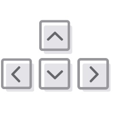
Keyboard Control
Keyboard accessibility is important for people with visual or mobility disabilities. Some people use modified keyboards or other tools that mimic its functionality, so don’t force mouse use.
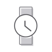
Timing
Give users enough time to read and use content.
Animation
Moving, blinking or scrolling information that (1) starts automatically, (2) lasts more than five seconds, and (3) is presented in parallel with other content should offer a mechanism for the user to pause, stop, or hide it.
Hierarchy, Headers and Breadcrumbs
Provide ways to help users navigate, find content, and determine where they are using appropriate visual hierarchy, headers to describe a topic or purpose, and breadcrumbs to give user’s location within a set of pages.
Understandable
Readability
16 pixels should generally be the minimum size for body copy in modern web design, however display resolution, reading distance, viewing context and user demographics should also be taken into account.
Understandable Content
For consumer facing content, keep copy at an 8th grade reading level or lower.
Predictability
Keep navigation consistent. Make interfaces appear and operate in predictable ways.
Error Prevention & Recovery
Eliminate error-prone conditions by giving users visibility to clear, concise system statuses and by presenting them with a logical infrastructure that’s well-engineered. Support undo and redo where it makes sense.
Robust
Compatibility
Maximize compatibility for current and future user tools, including assistive technologies.