Visual Design
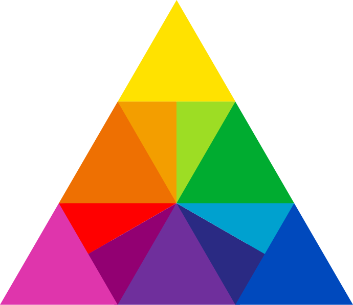
Color
Our base color palette contains a spectrum of 12, vibrant hues to reflect the wide variety and versatility of 3M. Each base hue includes 9 additional value swatches to help us in meeting the WCAG AA success criterion for minimum contrast.
Meaning
The base color palette reflects the wide variety and versatility of 3M. The palette below reflects the 3M brand in a more digitally accessible format.
Color Usage
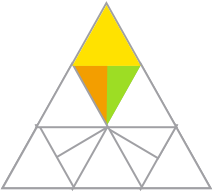
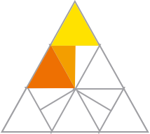
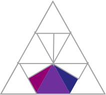
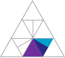
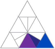
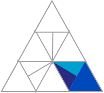
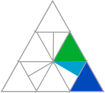
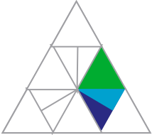
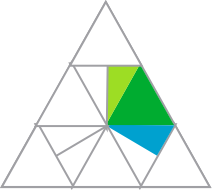
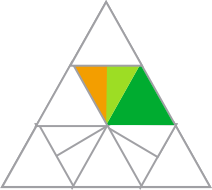
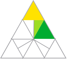
Selection of an interface color theme is outlined by the 3M brand guidelines. The primary color palette is to be composed of one of the eighteen analogous color sets shown here in conjunction with the grayscale color pallette. This should compose the dominant color theme of the UI with the exception of using additional colors sparingly when needed to add visual clarity.


Shades of Gray
These shades of gray can be used in conjunction with the chosen color theme. A wide array of values offers flexibility in regards to meeting appropriate color contrast ratios and working with our 12-base color palette. Use up to six in any single application.
Gray
0
HEX: #ffffff
RGB: 255, 255, 255
SCSS: color-white
3
HEX: #f8f8fa
RGB: 248, 248, 250
SCSS: color-gray3
5
HEX: #f2f2f5
RGB: 242, 242, 245
SCSS: color-gray5
10
HEX: #e4e4e8
RGB: 228, 228, 232
SCSS: color-gray10
20
HEX: #CCCCD0
RGB: 204, 204, 208
SCSS: color-gray20
30
HEX: #B4B4B8
RGB: 180, 180, 184
SCSS: color-gray30
40
HEX: #94949A
RGB: 152, 152, 156
SCSS: color-gray40
50
HEX: #808084
RGB: 128, 128, 132
SCSS: color-gray50
54
HEX: #76767A
RGB: 118, 118, 122
SCSS: color-gray54
60
HEX: #656569
RGB: 101, 101, 105
SCSS: color-gray60
70
HEX: #4C4C4F
RGB: 76, 76, 79
SCSS: color-gray70
75
HEX: #3C3C3F
RGB: 60, 60, 63
SCSS: color-gray75
80
HEX: #323234
RGB: 50, 50, 52
SCSS: color-gray80
85
HEX: #262627
RGB: 38, 38, 39
SCSS: color-gray85
90
HEX: #18181A
RGB: 24, 24, 26
SCSS: color-gray90
Color
This color palette was created to align with the 3M Trifecta Visual Guideline. Some colors have been modified for contrast on screen. Tints and shades are only to be used for interface element states like buttons and other controls.
Blue
5
HEX: #F0F4FB
RGB: 240, 244, 251
SCSS: color-b5
10
HEX: #DBE5F5
RGB: 219, 229, 245
SCSS: color-b10
20
HEX: #BACDEC
RGB: 186, 205, 236
SCSS: color-b20
30
HEX: #99B6E5
RGB: 153, 182, 229
SCSS: color-b30
42
HEX: #6B95DA
RGB: 107, 149, 218
SCSS: color-b42
50
HEX: #4F82D2
RGB: 79, 130, 210
SCSS: color-b50
60
HEX: #2967C9
RGB: 41, 103, 201
SCSS: color-b60
70
HEX: #0049BD
RGB: 0, 73, 189
SCSS: color-b70
80
HEX: #003180
RGB: 0, 49, 128
SCSS: color-b80
85
HEX: #002561
RGB: 0, 37, 97
SCSS: color-b85
Elevation
Though a screen only has two dimensions the technique of adding depth and elevation allows the designer to mimic real life hierarchy of importance based on proximity. Bringing elements front and center and a larger depth drives focus and creates a dominant element. The elevation structure below is based off the same multiples of 8 grid outlined in visual rhythm.
Elevation
Level 1
box-shadow: 0px 0px 1px rgba(0,0,0,0.12), 0px 1px 1px rgba(0,0,0,0.24);
Level 2
box-shadow: 0px 0px 2px rgba(0,0,0,0.12), 0px 2px 2px rgba(0,0,0,0.24);
Level 4
box-shadow: 0px 0px 4px rgba(0,0,0,0.12), 0px 4px 4px rgba(0,0,0,0.24);
Level 6
box-shadow: 0px 0px 6px rgba(0,0,0,0.12), 0px 6px 6px rgba(0,0,0,0.24);
Level 8
box-shadow: 0px 0px 8px rgba(0,0,0,0.12), 0px 8px 8px rgba(0,0,0,0.24);
Level 12
box-shadow: 0px 0px 12px rgba(0,0,0,0.12), 0px 12px 12px rgba(0,0,0,0.24);
Level 14
box-shadow: 0px 0px 14px rgba(0,0,0,0.12), 0px 14px 14px rgba(0,0,0,0.24);
Level 16
box-shadow: 0px 0px 16px rgba(0,0,0,0.12), 0px 16px 16px rgba(0,0,0,0.24);
Level 20
box-shadow: 0px 0px 20px rgba(0,0,0,0.12), 0px 20px 20px rgba(0,0,0,0.24);
Level 24
box-shadow: 0px 0px 24px rgba(0,0,0,0.12), 0px 24px 24px rgba(0,0,0,0.24);
Iconography
The below icons are propietary derivations made from our Streamline set specifically to address both accessibility and consistency in the context of our components. Our most commonly used icons that can exist in an interface without supporting text will be added to this library and must be pulled from this library. For any other icons, use the purchased Streamline icons or use them as a basis to create 3M proprietary icons that have at least a 2px line weight.
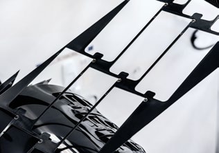
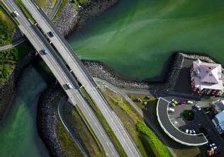
Imagery
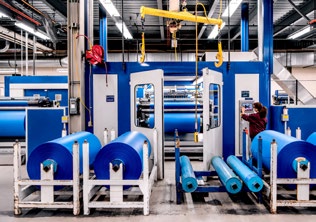
When using photography we can choose between four different ways to tell our story. The examples on the right show how different perspectives are used to highlight specific aspects of differing stories. We can talk specifically about how and where people interact with our products, in which industries they are used or what impact they have in the world. The 3M collection of photography is a showcase of our best examples across all the styles.

People
- People in context
- Portrait
Place
- External locations
- Internal locations
Product
- Product in context
- Product on white
Epic
Typography
Our new typeface is 3M Circular by Lineto. We will own our own customized version of Circular to use anywhere the 3M Brand is being expressed. 3M Circular is modern, more distinctive, easier to recognize and read.
We use 3M Circular Bold, Book and Light for all our communications. True italics are also available for each weight. Optimized around ultimate utility, we no longer rely on default fonts for our brand communications.
Fonts for web and screen
For web and other screen applications, it may be necessary to use a system font. We recommend the default system sans font, Arial, Helvetica or San Francisco.
Fonts for nonlatin languages
It may be necessary to use a default system sans font or Google font. We recommend Noto Sans for its multiple language support.
Aa
ABCDEFGHIJKLMNOPQRSTUVWXYZ
abcdefghijklmnopqrstuvwxyz
1234567890(,.;:?!$&*)
Aa
ABCDEFGHIJKLMNOPQRSTUVWXYZ
abcdefghijklmnopqrstuvwxyz
1234567890(,.;:?!$&*)
Aa
ABCDEFGHIJKLMNOPQRSTUVWXYZ
abcdefghijklmnopqrstuvwxyz
1234567890(,.;:?!$&*)
Aa
ABCDEFGHIJKLMNOPQRSTUVWXYZ
abcdefghijklmnopqrstuvwxyz
1234567890(,.;:?!$&*)
Aa
ABCDEFGHIJKLMNOPQRSTUVWXYZ
abcdefghijklmnopqrstuvwxyz
1234567890(,.;:?!$&*)
Aa
ABCDEFGHIJKLMNOPQRSTUVWXYZ
abcdefghijklmnopqrstuvwxyz
1234567890(,.;:?!$&*)
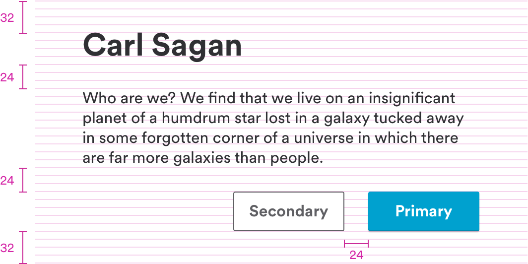
Visual Rhythm
Our element spacing is based on a multiples of 8 grid system. This system provides a flexible framework for arranging elements in a logical and predictable rhythm.
Usage
helps to simplify the translation of design layout in development.
Spacing Sizes


Margin and padding
Use increments of eight to define width, height, margins and padding.
Voice
Our voice is our style of writing and speaking. It’s how our customers come to know us and our personality. Our voice is personable, accessible, clear, and concise.
4 style tips to write on-brand within digital products
- Get to the point – quickly and clearly with simple, concise writing.
- Focus on what matters most to your audience. Use language that resonates with them.
- Aim to engage, delight and surprise your audience with clever writing and unexpected insights.
- Use everyday language to create a conversational feel. Avoid technical jargon unless it is language used by your audience.
Examples
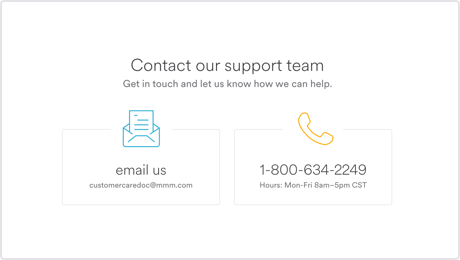
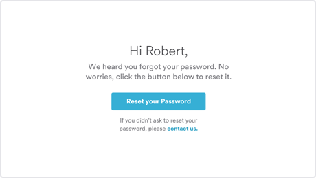
These real-life examples bring a touch of humanity into otherwise mundane messages. Use opportunities like these to give users a glimpse of our personality.
Contact
Password reset email
Terms