
Definition
Elements
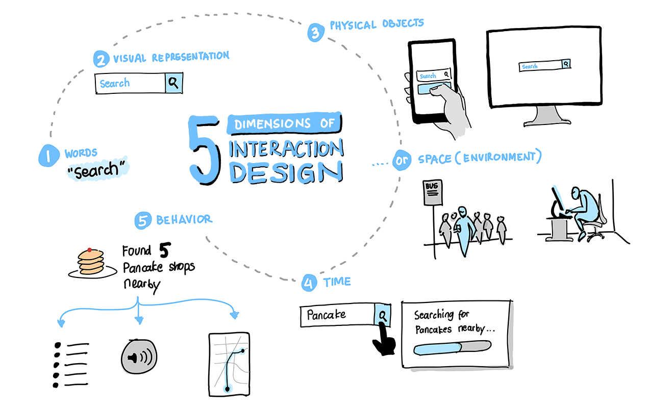
- 1D: Words
For Interaction Design, words should be meaningful, simple and concise. Button labels/text links should communicate actions or a clear direction for navigation. - 2D: Visual representations
Graphic elements like images, typography, and icons to assist words in conveying information to users. When in doubt, always add words to visual elements for more clarity. - 3D: Physical objects or space
This takes into consideration the physical object or tool used to communicate during the user’s interaction; also, the space in which the interaction is happening in provides context to how a user may choose to interact with objects or tools. - 4D: Time
Animation, video and sounds provides feedback to user’s interaction and can enhance their experience. Time spent interacting with our product is also a consideration — look for ways to inform progress, complete contextual micro-interactions and resume interactions in a later time. - 5D: Behavior
How products are used, their actions, mental models and goals are part of the behavioral impression. Even short- and long-term emotional reactions play a role in the perception of a product’s ease-of-use.
Source: Interaction Design Foundation
Interaction Design Principles
7 Principles & Best Practices
1. Mode of Interaction
Define how users interact with the interface — what input mechanism to use (mouse, finger, stylus) and what interaction triggers to employ best (clicking, gesture, or indirect trigger like voice).

2. Visibility
Visibility aids user awareness about the interface elements and their functions. The size and placement of elements should enable clear interaction so users can effectively & efficiently accomplish their tasks.

3. Affordance
Give users clues about interaction behavior & how to use it through the trigger attributes, appearance and additional information when needed.

4. Constraints
Limit the range of interaction possibilities to simplify the interface and guide user exploration. Constraints can also help with preventing users making mistakes.

5. Mapping
Establish clear relationship between what user can control and the effect/output they have on the system. If affordance provides visual clues, mapping provide more specific cues (or signals) to help users anticipate what the outcome of their specific actions would produce.

6. Feedback
Clearly communicate to users when action has been taken and what has been accomplished. In error prevention, system feedback can also take a form of warning (before user commits to an action) and a guide to inform what the mistakes are and how to recover from them.

7. Consistency
Leverage similar operations, elements and patterns throughout the experience. Consistency reduces cognitive load as it incorporates familiar formats and standards so users can quickly learn how to use the products based on their knowledge & experience using other products.
Sources: Medium and Usability.gov
Design Patterns & Interaction Guidelines
Buttons
General Guidelines
Buttons should be used to identify important actions.
There should be only one primary button on each page or dialog. Avoid using too many buttons on one page. If there are many actions, identify which ones are less important and stylize them as a tertiary button.
Component Variations
Primary – The most important action on the page
Secondary – Less important actions
Tertiary – Utilized when an action needs to be available, but there might be too many buttons being used or there is space restrictions.
Button Group – Used to create toggles between actions where only one can occur at a time.
Button Group With Dynamic Text
Visual Variations
With Icon
With Counts
Disabled
Success
Danger
Organization
Primary buttons should appear to the right and secondary to the left if they are paired together.
Labeling and Icons
Keep the text in a button short and use action verbs such as “Save,” “Enter,” or “Delete.”
Icons can help indicate common actions. Use buttons that utilize just icons sparingly, especially with less common actions. In addition to icons, buttons can contain counts or additional information to convey more meaning.
Accessibility Guidelines
Buttons should have a focus state.
Screen readers handle links and buttons different. It is important to make sure you aren’t use links as buttons and vice versa.
Checkboxes
General Guidelines
Checkboxes are utilized by users to communicate a selection. Checkboxes can occur as a single selection, in a list of options, or in a data table row.
Users should be able to select an option by clicking the button or the label.
Do not use a checkbox for turning a feature or mode on or off. Instead use a toggle.
If there is a list and the user can only make a single selection out of a list, use a radio button instead.
Component Variations
Single checkbox – Used for a binary input
Checkbox Group – Used for a user to communicate one or more selections.
Select All/Deselect on grid – Used to select or deselect multiple checkboxes within a data table.
Accessibility
Dropdown/Select
General Guidelines
A dropdown is used when a user needs to provide input.
You should use a dropdown when a user needs to select one value when there are between five to fifteen options.
If there are less than five options, please use radio buttons. The only exception might be if the dropdown is grouped with another input field. Like choosing AM or PM next to a time field.
If there are more than fifteen options, utilize our component where the user is able to filter for a value. A good example is the “Content with filters” or “Autocomplete” InputGroup in Prime-Ng.
Component Variations
Standard Dropdown – One where you select a single value out of a list
Filterable Dropdown – The dropdown becomes a field where a user can start typing and filtering the options below.
Multiple Select Dropdown – Utilize checkboxes to all the user to select multiple.
Accessibility Guidelines
Make sure the dropdown is labeled appropriately.
Date Picker / Calendar
General Guidelines
This input component is used when a user needs to enter in a date and/or time.
There are scenarios where it might make more sense to allow people to type in the date (especially if it for just a month and/or year) and provide validation.
If the user is looking to search for dates within the near future or past, then it makes more sense to use the date picker.
Internationalization Considerations
There are seven common variations on how dates can be presented to users. It is important to capture the users preferences or their location to more accurately format the date for them.
Component Variations
Basic – Select a single date
Min-Max – Select a date and then apply all dates before or after
With Time- Includes the option to select a time
Multiple Days – Select multiple days that do not have to be consecutive (like the range or min-max requires)
Text Input Fields
Utilized to provide an input area where a user can enter in content
General Guidelines
Allow the input field to be the size of the expected amount of text to be entered.
Avoid using this for something longer than one line (for longer content, use a text area). Also avoid using this when inputted values can be expected like dates or items from a list. Instead use the date picker or a dropdown for those.
Provide validation to help users submit the correct content.
Input fields should be labeled.
Component Variations
Short Text Input
Long Text Input
Text Input With Character Count
Accessibility
Make sure order is identified and ordered using HTML
Provide validation within close proximity to the input field. Not on other areas of the page.
Avoid placeholder text as that can confuse screenreaders.
Radio Buttons
General Guidelines
This input component is used when a user can only select one value out of a list between two to five options. For longer lists, use a dropdown. For shorter lists, consider a checkbox. Consider a dropdown if you wish to provide a user the option of selecting none of the options.
A radio button should always have a default selection.
Component Variations
Basic
Accessibility
List items vertically.
User proper labels and attributes.
Slider
General Guidelines
A slider is generally used when a user can select a number value out of a range of options greater than fifteen. If less than fifteen, consider using a dropdown menu or other options. Text inputs might be considered if the range of options gets into the hundreds and thousands of options.
A sliders is also good to use when the range is more important than necessarily an exact numerical value.
Component Variations
Basic – Where the slider represents the total
Range – Where the sliders represent the minimum and maximum.
Examples
Pattern Examples
Sign In + Register
Modals
Globalization
Grid
- Coming soon
Future Content
-
Content Creation
-
Messaging
-
Complex Table
-
Media upload / Gallery
-
Installation
-
Toolbar/Tool palette
-
Search
- Touch Interface
- Voice